City of Durham
Community Engagement & Participation Department Webpage Redesign
JUNE 2026 | Role, Design Consultant
The City of Durham’s Community Engagement and Partnerships Department needed a
Project Background
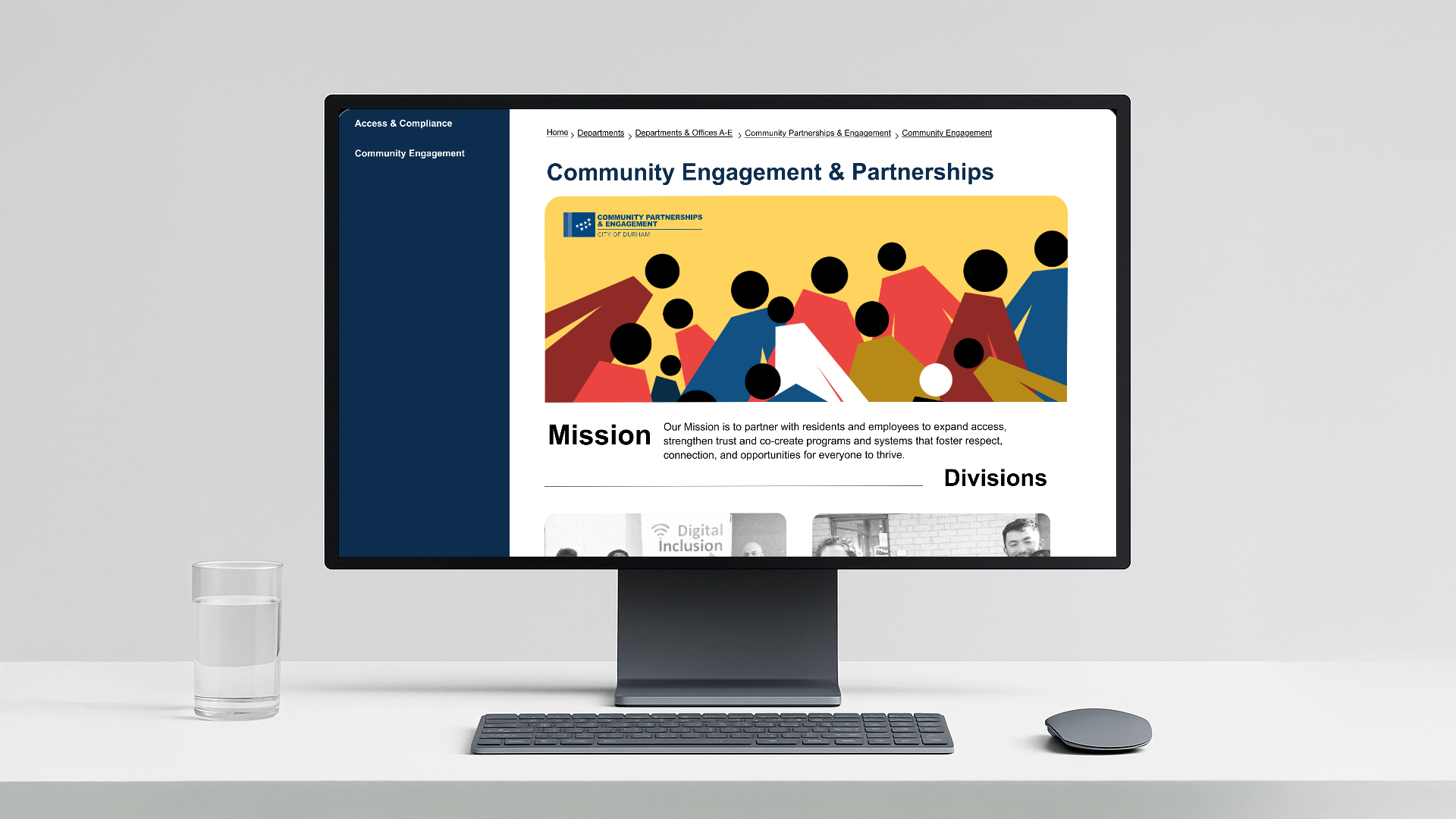
The Community Engagement and Participation was undergoing internal restructuring and wanted a fresh design to attract citizens and increase event participation. City of Durham’s department websites are created within a dated website municipal building software that limits design flexibility and creates ridigid layouts.
Objective
My task was to create a new and better navigation system for the website that followed user expectations. The design should be WCAGG accessible and easily built within limiting software.
Interactive Prototype
Research
There was little starting information to begin the project. I needed learn more about the website’s purpose and navigation. I seeked to gain more information by interviewing department members to learn more about its functions and clicked through everypage currently available on the department site.
Interviews
I conducted informal interviews with team members across the department to better understand their roles, responsibilities, and program areas. These conversations helped me learn how the department serves its audiences, identify key staff perspectives, and gather context about the information residents most often need from the website.
Webpage Audit
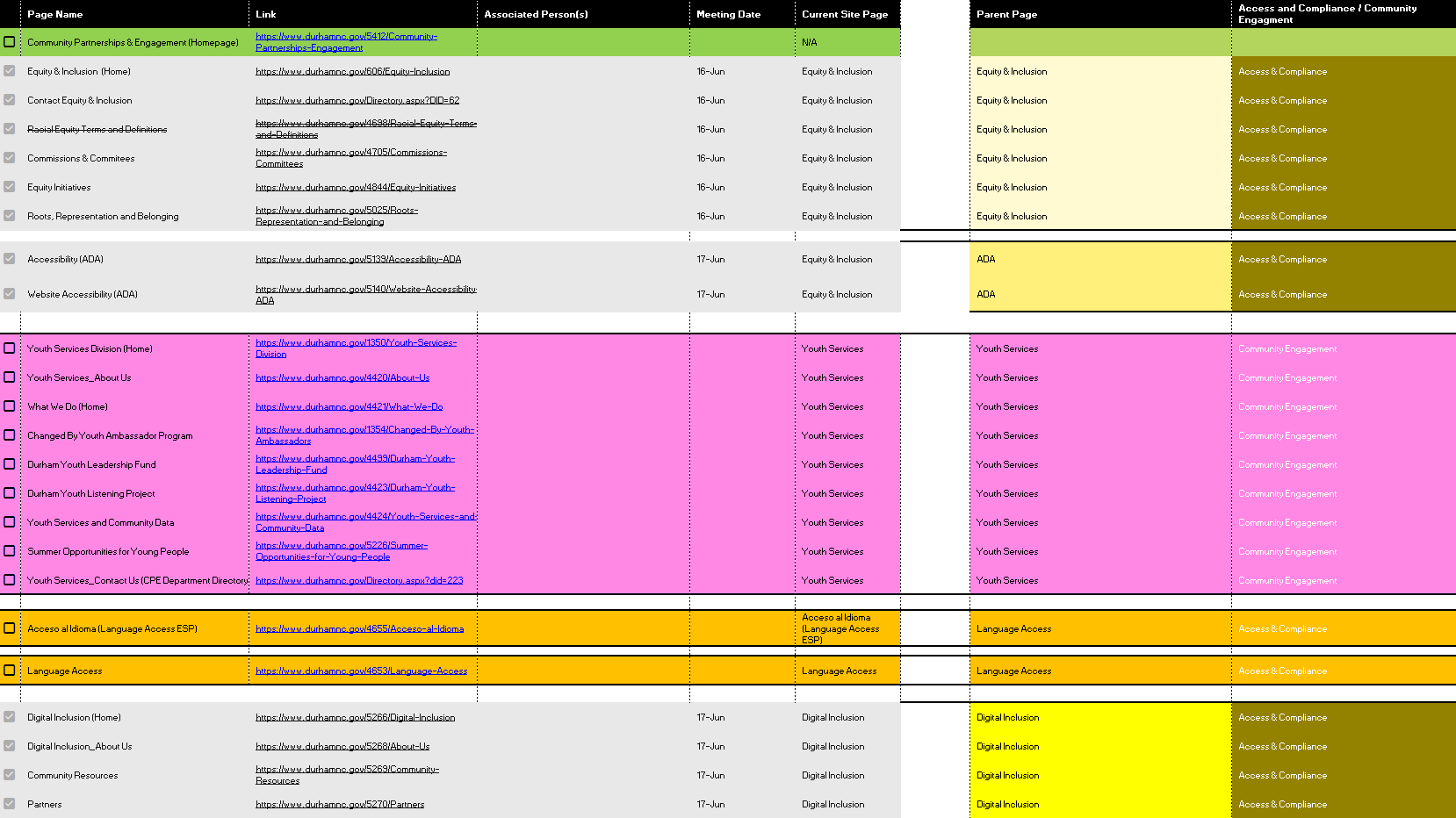
I conducted a content inventory and link audit to document each page and navigation path, then used the findings to ensure every page was reviewed with a relevant staff member or program owner.
Combining Audit & Interview Data
I developed a spreadsheet-based tracking system (see above) to catalog each website page, department division, and associated staff contact. As interviews and audits provided new information, I updated the tracker and used it to organize content relationships, confirm ownership, and guide the proposed website structure.
Key areas of user friction for design Intervention
There were many areas for improvement on the website. Below are couple of areas that stuck out in need for design intervention and proposed solutions to incorporate into new design.

1
Unclear User Goals
Landing pages lacked clear goals and contained too much information residents did not need while hiding important information in documents and links.


Add Details & Calls to Action
Surface key program details & reorganized pages around need-to-know information and calls to action, helping residents understand services, eligibility, and next steps faster.

2
Information Overload
Dense, overwhelming content made program information less inclusive for diverse residents with different reading levels, language needs, and time constraints.
Digestible Sectioning
Make the pages less text reliant through the use imagery, buttons, arrows, and icons and shorter descriptions to create clear, easy-to-digest calls to action
3
Underrepresented Impact
The website did not clearly show community engagement, making resident participation and impact less visible.
Highlight Outcomes
Add areas visual impact. These sections make resident participation more visible by highlighting real people, programs, and outcomes residents can connect with.
Design Elements
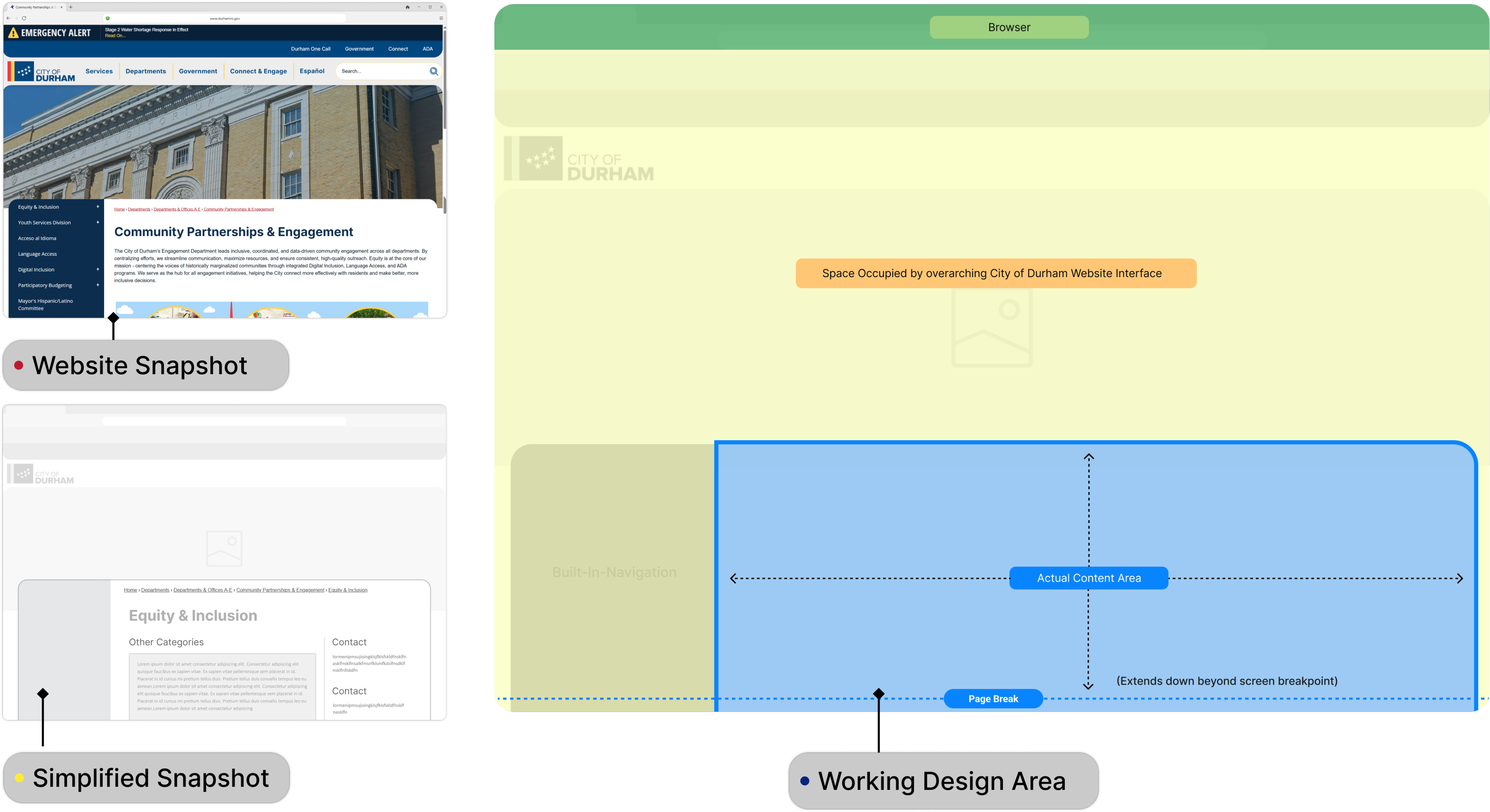

Identifying the Content Space
I examined the website I noticed that the core area for information was nested in preexisting UI elements of the overall City of Durham website. As result two-thirds of the screen real-estate was occupied by non vital information. I made a point to make sure as much valuable information as possible was visible above the fold.

Grid System
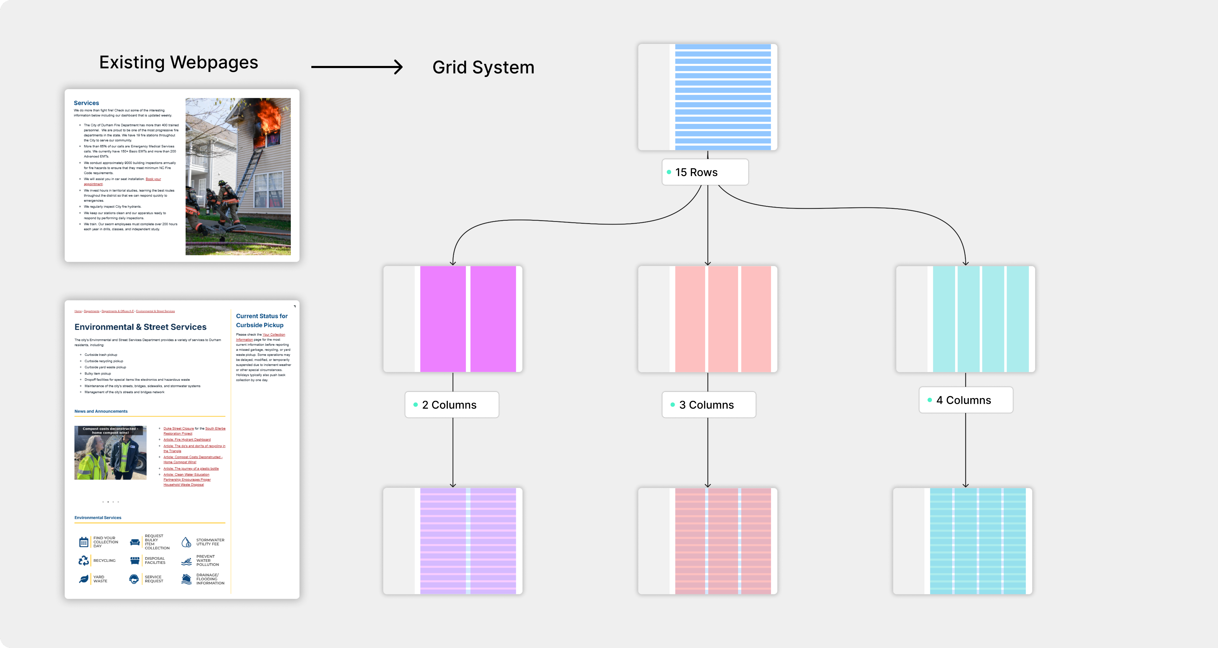
As design contractor I did not have access to the software used to build the website. I used deductive reasoning to create a grid system based on patterns I discovered on other website pages.
I noticed that column numbers varied by page with 4 columns being the maximum. I incorporated the other column amounts to create a more dynamic layout. I used 15 rows for the grid system to have ample flexibility for vertical spacing
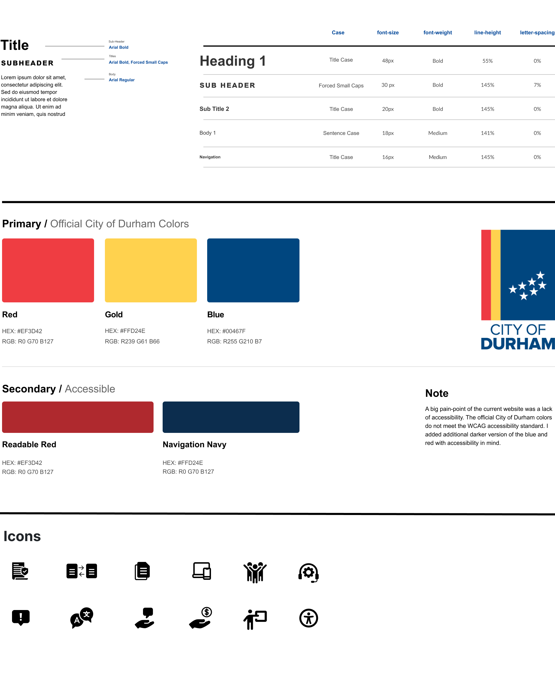
Style Guide